Launched initially as Tez in India, Google Pay has in a short span of time given tough competition to the strongholds like Paytm and Phonepe. And now this digital wallet platform has received a much-needed material design makeover, giving it a fresh new look. Right from the main menu to your avatar, everything has adopted a much cleaner interface. Let’s have a look at all the Google Pay’s material design changes that the app has undergone. And if you are new to Google Pay, don’t forget to check out our guide on the steps to set up and use Google Pay.
Google Pay’s Material Redesign
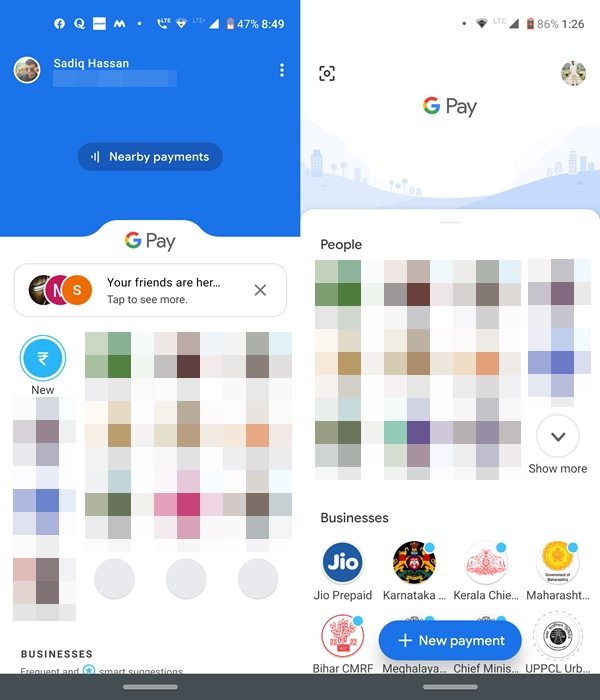
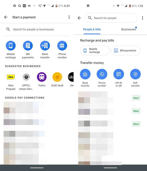
Beginning with the main screen, Google Pay’s material design update has removed the Nearby payments option situated at the top. In the header, which earlier used to store your UPI ID and username has been replaced with a QR Code scanner. Your profile has also been moved to the top right, with only your display picture being visible.
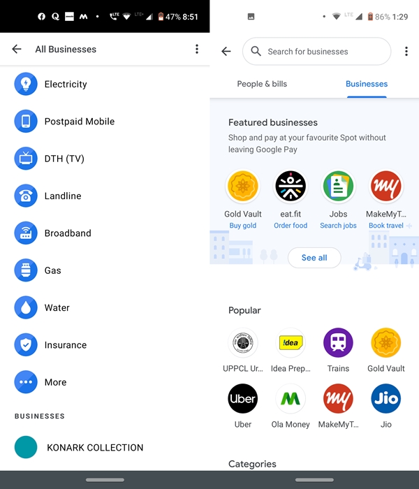
The Suggestion menu has also been made clutter-free, as could be seen in the Businesses section. Moreover, Google Pay’s material design update has also added a ‘New payment‘ floating button at the bottom of your screen. Tapping on it will take you to a redesigned search area. Moreover, the Mobile Recharge, Businesses, People and Bill Payments earlier used to cluttered under a single page. Now each one has been categorized and placed under different tabs.
Don’t Miss: Google Pay vs Samsung Pay – A Detailed Comparison
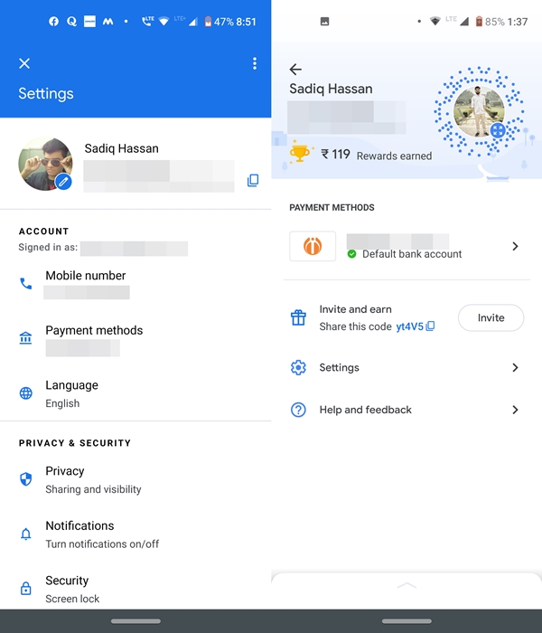
Google Pay’s profile section has also very neatly adopted the material design. In the header section, your avatar is now surrounded by associated Spot Code. Moreover, you may also see your total rewards earned under the same section. Earlier there were tons of other options like Payment Methods, Languages, Privacy, Notifications, etc. All this has now been moved under the Settings tab, giving your profile section a fresher look.
Availability
Google Pay’s material design updates are being handled in a server-side manner. So not everyone will receive the update at one go. But considering the fact that rollout is taking place since the past week, you may go ahead and download the Google Pay app version 47.0.001_RC02 from the Play Store and check for the Google Pay’s material design makeover.
Read Next: Files by Google now lets you Hide Suggestions Cards

Join The Discussion: